
Why Smart Text Scaling Matters in Multi‑Size Banner Campaigns
Multi‑size banner campaigns live or die on legibility.
You’re pushing the same message into 300×250, 728×90, 320×50, 970×250, and flexible aspect‑ratio units — and one font size will never work everywhere.
The IAB has already urged the industry to “ditch fixed‑size ads,” and Google’s Display Network now treats responsive display ads as the default. That means your text scaling rules have to survive many placements, not just a few standard units.
This tutorial walks through a practical way to:
Scale text across multiple ad sizes from a single master
Apply banner generator resize text rules consistently
Set min/max font size thresholds
Scale font by content priority (headline vs body vs CTA)
Test outputs in real placements before launch
We’ll reference concepts from the pillar article “Multi‑Size Banner Generators: Complete Guide to Smart Text Scaling Across Formats” and show how to operationalize them inside a production system like Viewst, Google Web Designer, or a custom HTML5 setup.
Prerequisites: What You Need Before You Define Text Rules
Before you configure any smart text scaling, make sure you have:
A master creative that represents the core layout and hierarchy
Brand typography specs (typefaces, weights, line heights)
Content priority tiers (e.g., H1 headline, subheadline, body, CTA)
A banner generator or HTML5 production system that supports rules
Recommended tools for implementation
You can apply the steps below in:
Viewst – AI Smart Resize, brandbooks, native HTML5 output
Google Web Designer – container‑based text fitting, min font settings
Custom HTML5/CSS – media queries and dynamic font sizing
Adobe’s 2024 productivity brief found 74% of creative professionals spend 50% of their time on repetitive, non‑creative tasks and mid‑market businesses juggle 137 apps on average. Smart text scaling rules are one of the simplest ways to remove that repetitive resizing work from your team.
Step 1: Define a Hierarchy‑Driven Typographic System
1.1. Map content to priority tiers
Start by turning your copy into a structured hierarchy. This makes scaling font size by content priority predictable.
Create a simple tier map:
Tier 1 – Primary headline (H1)
The core message; must be legible at a glance
Tier 2 – Secondary line or benefit (H2)
Optional, supports the headline
Tier 3 – Body text
Short explanation, disclaimers, or offer details
Tier 4 – CTA
Action phrase ("Start free trial", "Apply now")
Assign each copy element to one of these tiers in your master creative.
1.2. Set base font sizes on the master creative
Choose a "reference" size — usually a mid‑range unit like 300×250 or 728×90.
For that size, define base font values:
Tier 1 (H1): e.g., 26–30 px
Tier 2 (H2): 18–22 px
Tier 3 (Body): 14–16 px
Tier 4 (CTA): 16–18 px (often bold or all caps)
Use a consistent ratio between tiers (e.g., 1.4× from H2 to H1) so the generator can preserve relative size differences automatically.
Google Web Designer explicitly supports preserving relative text sizes inside a container, and Viewst’s AI Smart Resize mirrors this principle: your master creative becomes the single source of truth for all scaled versions.
Step 2: Create Scale Text Rules by Banner Size and Aspect Ratio
2.1. Group your formats
List the sizes you use frequently. For example, from Google’s uploaded display ad specs:
Rectangles: 300×250, 336×280
Leaderboards: 728×90, 970×90, 970×250
Skyscrapers: 160×600, 300×600
Mobile: 300×50, 320×50
Then group them by aspect ratio or category:
Wide horizontal (728×90, 970×90, 970×250)
Standard rectangle (300×250, 336×280)
Vertical (160×600, 300×600)
Small mobile (300×50, 320×50)
Flexible units from the IAB’s new portfolio (e.g., 2:1, 4:1, 9:16) can join the closest category based on orientation.
2.2. Decide scaling factors per group
For each group, define how much to scale text relative to the master.
Example rules:
Standard rectangle group (master):
H1: 100% of base
H2: 100% of base
Body: 100% of base
CTA: 100% of base
Wide horizontal group:
H1: 110–120% (more horizontal real estate)
H2: 100–110%
Body: 90–100%
CTA: 100–110%
Vertical group:
H1: 90–100%
H2: 90–100%
Body: 90–100%
CTA: 100% (keep button legible)
Small mobile group (300×50/320×50):
H1: 85–90% of base
Body: often removed or collapsed into the headline
CTA: 90–100% (high priority)
In Viewst, this logic can live inside AI Smart Resize + brandbooks:
Your master creative defines the sizes
Smart Resize applies the scale text rules per format
In a custom HTML5 setup, encode these rules as:
CSS classes per tier (e.g.,
.banner-h1,.banner-body)Media queries per size group that adjust
font-sizeproportionally
Step 3: Set Min and Max Font Size Thresholds for Legibility
3.1. Why thresholds matter
Without min/max font size limits, automation can make text technically "fit" but impossible to read.
Google Web Designer defaults to a 10 px minimum font size when fitting text to a container and truncates beyond that. For legible, glanceable banners, your minimums should be higher.
Accessibility guidance from W3C and NNGroup emphasizes:
Text should be resizable up to 200% without breaking layout
Default sizes should be reasonably large, especially for quick‑scan reading
3.2. Define per‑tier min/max values
Create a simple table of thresholds your system must respect.
Example for desktop banners:
Tier 1 (H1) – Primary headline
Min: 18 px
Max: 42 px
Tier 2 (H2)
Min: 14 px
Max: 28 px
Tier 3 (Body)
Min: 12 px
Max: 20 px
Tier 4 (CTA)
Min: 14 px
Max: 26 px
Example for small mobile units (300×50, 320×50):
Tier 1 (H1)
Min: 14 px
Max: 20 px
CTA
Min: 14 px
Max: 18 px
3.3. Configure thresholds in your tooling
In Viewst or similar systems:
Use brandbooks or text style presets to set min/max font sizes
Lock those styles so AI Smart Resize cannot violate them
In Google Web Designer:
Use
gwd-min-font-size-pxfor dynamic text elementsEnsure this is set globally or per element to your chosen minimums (e.g., 14 instead of 10)
In custom HTML5:
Avoid automated font scaling below your thresholds
Use CSS clamp:
font-size: clamp(14px, 2vw, 26px);for responsive behavior
Step 4: Implement Automated Text Fitting and Overflow Rules
4.1. Decide your overflow policy per tier
Automated text fitting algorithm behavior should be different for each priority tier. Think in terms of:
Shrink to fit vs truncate vs wrap
Example policy:
Tier 1 (H1):
Behavior: shrink to min, then wrap into 2 lines
Only truncate if absolutely required for tiny sizes
Tier 2 (H2):
Behavior: shrink to min, then truncate with ellipsis
Tier 3 (Body):
Behavior: truncate aggressively and move details to the landing page
Tier 4 (CTA):
Behavior: never truncate; rephrase copy if it doesn’t fit
4.2. Container‑based rules
Tools like Google Web Designer and Viewst treat text as content inside a bounding box.
Configure for each container:
Fit mode (e.g., "shrink to fit" or "overflow hidden")
Line‑height and max lines per tier
Alignment (center, left, right) consistent across sizes
In a banner generator, your resize text rules might look like:
If
text-height > container-height:Reduce font size until min threshold reached
If still too tall, apply truncation rules
This lets your system solve dynamic ad resizing text overflow without manual tweaks for each size.
Step 5: Encode Rules in a Banner Generator or Design System
5.1. In Viewst (master‑creative approach)
Viewst is built around the belief that master creative is the single source of truth.
To set up scaling rules:
Create your master banner in Viewst with typography tiers and layout.
Apply brandbook styles for H1, H2, body, and CTA, including min/max sizes.
Use AI Smart Resize to generate all required sizes (e.g., 300×250, 728×90, 320×50).
Configure text behavior (wrap vs truncate) per layer.
Save this setup as a production template for future campaigns.
This turns your smart text scaling model into reusable infrastructure that your whole team can rely on.
5.2. In Google Web Designer
For teams already using Google Web Designer:
Tag text elements with clear classes per tier (
.banner-h1,.banner-cta).Set
gwd-min-font-size-pxon these elements according to your thresholds.Use responsive layouts and media rules to adjust font size by group.
Configure text fitting mode to "reduce text to fit" for key containers.
Preview in multiple sizes using the built‑in responsive preview.
5.3. In custom HTML5/CSS
For fully custom systems:
Define CSS variables for tier font sizes, e.g.
--h1-size-base: 28px;.Use size‑specific classes or media queries to scale these variables per group.
Apply
clamp()for responsive HTML5 banner text scaling best practices.Implement a text‑measurement script (if needed) that checks overflow and applies classes like
.truncateor.wrap-two-lines.Keep bundle size under limits (e.g., Google Ad Manager’s 1 MB cap for HTML5 bundles) when adding logic.
Step 6: Test Creatives in Real‑World Placements
6.1. Why testing matters
Adobe’s 2026 Digital Trends report found half of customers give promotional content only 2–5 seconds to earn attention.
If your text is too small, clipped, or misaligned in real placements, those seconds are gone.
Google’s Campaign Manager 360, DV360, and Ad Manager all stress previewing creatives in realistic device contexts before launch.
6.2. How to test systematically
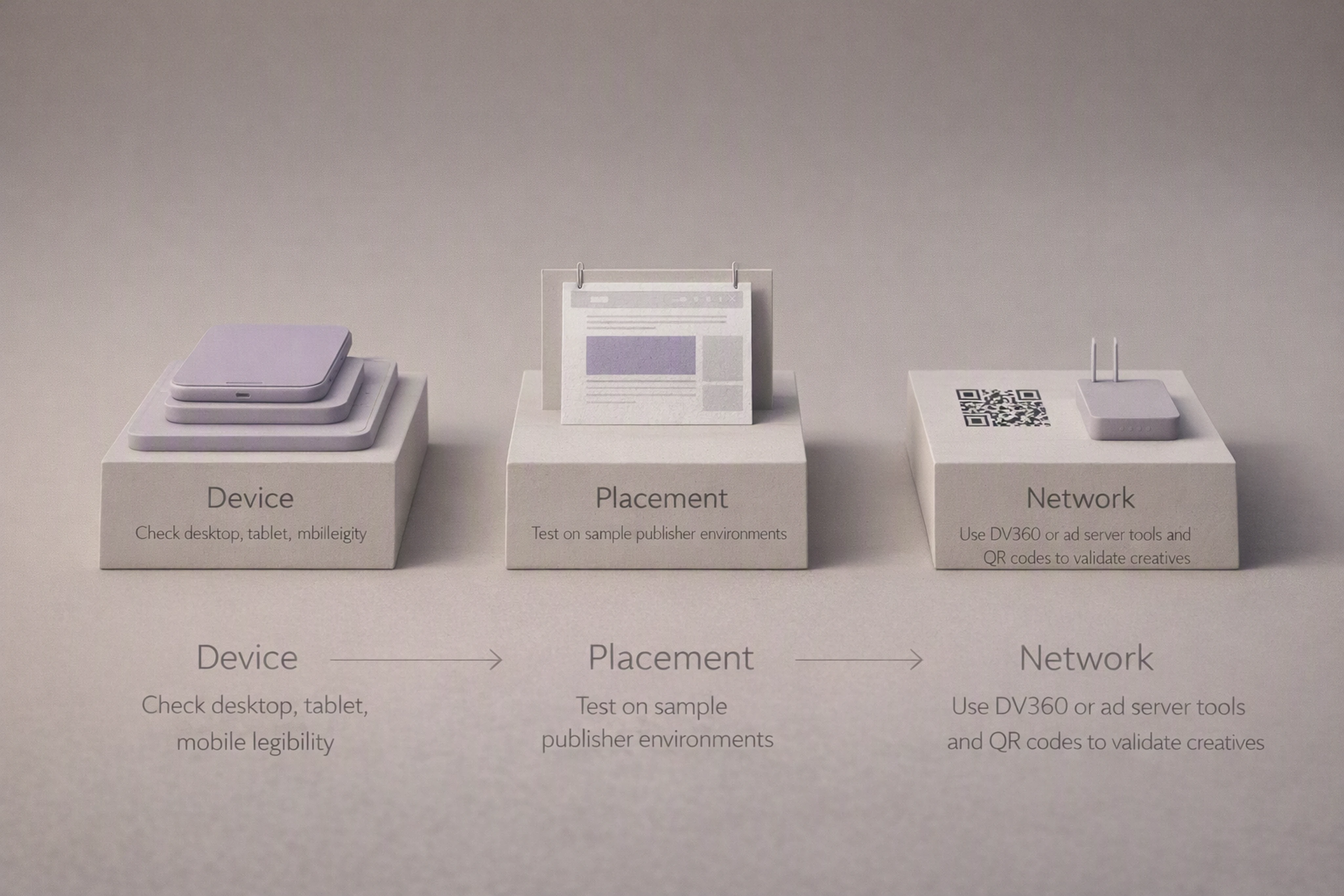
Test in three layers:
Device preview
Desktop, tablet, mobile
Landscape and portrait orientations
Placement preview
Simple content page, news site, app environment
Check contrast against typical backgrounds
Network preview
Use DV360 QR‑code testing to view creatives on real phones
Share preview links for stakeholder review
Here’s how to turn that into a reusable checklist:
Open the banner in your production tool’s preview mode (Viewst, Google Web Designer, DV360).
Toggle through all sizes; check:
Is H1 readable at arm’s length?
Is the CTA fully visible?
Does any text wrap in unexpected ways?
Use real devices:
Scan DV360 QR preview on mobile
Load test pages that mirror your top publishers
Log issues as rule violations (e.g., "H1 fell below 18 px on 320×50").
Adjust global rules (scaling factor, min font) rather than fixing one‑off banners.
This keeps your creative system consistent and prevents ad‑hoc edits that break brand control.
Step 7: Operationalize Smart Text Scaling Rules Across Teams
7.1. Turn rules into documented standards
Write down your scaling model so it becomes part of your creative operations, not tribal knowledge.
Include:
Tier definitions and base sizes
Per‑group scaling factors
Min/max thresholds per tier
Overflow policies (shrink, wrap, truncate)
Testing checklist
7.2. Bake rules into templates and brandbooks
In Viewst or similar platforms:
Create locked templates that embody your rules
Use brandbooks to enforce typography across markets
Keep collaboration inside the production environment so feedback aligns with the system
This aligns with Viewst’s mission: removing non‑creative suffering from creative work by turning production complexity into stable infrastructure.
FAQ: Smart Text Scaling for Multi‑Size Banners
1. How do I scale font size by content priority in banners?
Assign each text element to a priority tier (headline, subheadline, body, CTA), define base font sizes on a master creative, then use consistent ratios between tiers.
Apply scaling factors per size group (e.g., wide, vertical, mobile) while preserving the ratios so the visual hierarchy stays intact.
2. What are good min and max font sizes for banner ads?
For desktop banners, common ranges are:
Headlines: 18–42 px
Body: 12–20 px
CTA: 14–26 px
For small mobile units (300×50, 320×50), keep headlines and CTAs at least 14 px. Always test against your actual fonts and placements.
3. How do I prevent text overflow in dynamic, multi‑size banners?
Use container‑based rules:
Shrink text down to a defined minimum
Then either wrap (for headlines) or truncate (for body copy)
Configure these behaviors per tier in your banner generator, and rely on a master creative plus Smart Resize to apply them consistently.
4. How can I test banner text scaling in real placements?
Use preview tools from ad platforms like DV360 and Campaign Manager 360, including device previews and QR‑code tests.
Load creatives on real devices, on test pages that mimic your target sites, and log issues as rule adjustments (min font, scaling factors) rather than one‑off fixes.
5. Why use a dedicated HTML5 ad production platform like Viewst for this?
Viewst sits between design tools (like Figma and Adobe) and media platforms (like ad servers and DSPs).
It treats banner production as infrastructure:
AI Smart Resize generates all sizes from one master
Brandbooks enforce typography rules
Native HTML5 output and integrated review keep everything stable
That means your smart text scaling rules become part of a governed system, not just a manual trick in a single campaign.

Victoria is the CEO at Viewst. She is a serial entrepreneur and startup founder. She worked in Investment Banking for 9 years as international funds sales, trader, and portfolio manager. Then she decided to switch to her own startup. In 2017 Victoria founded Profit Button (a new kind of rich media banners), the project has grown to 8 countries on 3 continents in 2 years. In 2021 she founded Viewst startup. The company now has clients from 43 countries, including the USA, Canada, England, France, Brazil, Kenya, Indonesia, etc.
In this article
" height="11.060000000000002px" id="wzBCZ87AK" transform="translate(6.47 2.47)" width="6.590000000000003px"/></g></svg>)